Welcome back to my series where we observe and study the specific traits of a kind of character design (and then try to make our own!)
In our last video in the Let’s Design series, we took a whack at animated series characters. Our constraints generally had to do with budget. This vary of course, but our character being quick, easy, and cheap to animate (relatively) factored heavily into the design. Simple iconic shapes that read well when flat from multiple angles won the day.
But as we move into retro game characters, the constraints are now representative of our limited resolution. Mainly we want to look at two specific traits, Constraints & Purpose.
Watch this video now!
Sidebar: while we talk about the vast umbrella that is “retro” game characters, we’re talking about an era of characters from the 8 and 16 bit era of course, where the amount of pixels that represented them were limited, but we can also include, easily, the first generation of 3D console games. Because while the resolution was relatively better, with a game like Mario 64 or Crash Bandicoot, their low poly look still limited the amount of shapes and kinds of shapes you could make, let alone the other factors of readability that we’ll take into account.
So let’s talk about our first key trait: Constraints
The smaller our character gets, the more readable they need to be, which means their shapes and design needs to be as clear as possible. One predominant design principle in so many retro game characters is segmentation. What is segmentation, you ask? It’s the practice of using colors to create delineation between segments of the design to show which part of the character is facing in a certain direction.
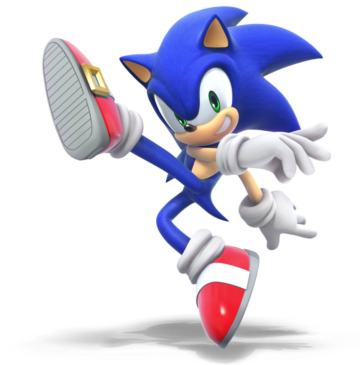


For instance, Sonic, Crash, and Kirby all have Red shoes, so that when we see motion it’s eye catching.


Mario, Mega Man, and Sonic have pale tones contrasting against blue for portions of their anatomy. If there’s an intense amount of detail, like with Samus, it’s implied rather than shown outright.

There’s also a difference with some aspects of design depending on what part of our character is shown. The talking portraits in Starfox and Starfox 64 are about as tall as a full character in some of our other games, which means the detail on the face can afford to be much richer— again, we work within the constraints of resolution.
Let’s talk about our other key trait: Purpose
With any playable game character, the purpose is to translate gameplay for the person playing the game —a sort of surrogate for their actions— the same way that a tennis ball demonstrates the amount of force that a player put into it.
For Olimar from Pikmin, he’s one half of a cursor system, anchoring it on screen. For first person games, it’s all about the hands and what’s being held. For most of our retro characters though, it’s about platforming. More than just showing us our actions on screen, game characters often do well to show us why they are capable of doing what they’re doing. Folks in the game industry usually call this their “source of power”.


This is a fairly basic character design idea, but it all comes down to emphasizing what’s important. Maybe their power is innate, like Sonic’s speed, but his big flashy shoes give us an indication that his speed is his primary trait. For Kirby, his sucking in, flying, and power absorbing all revolve around his balloon-like body.
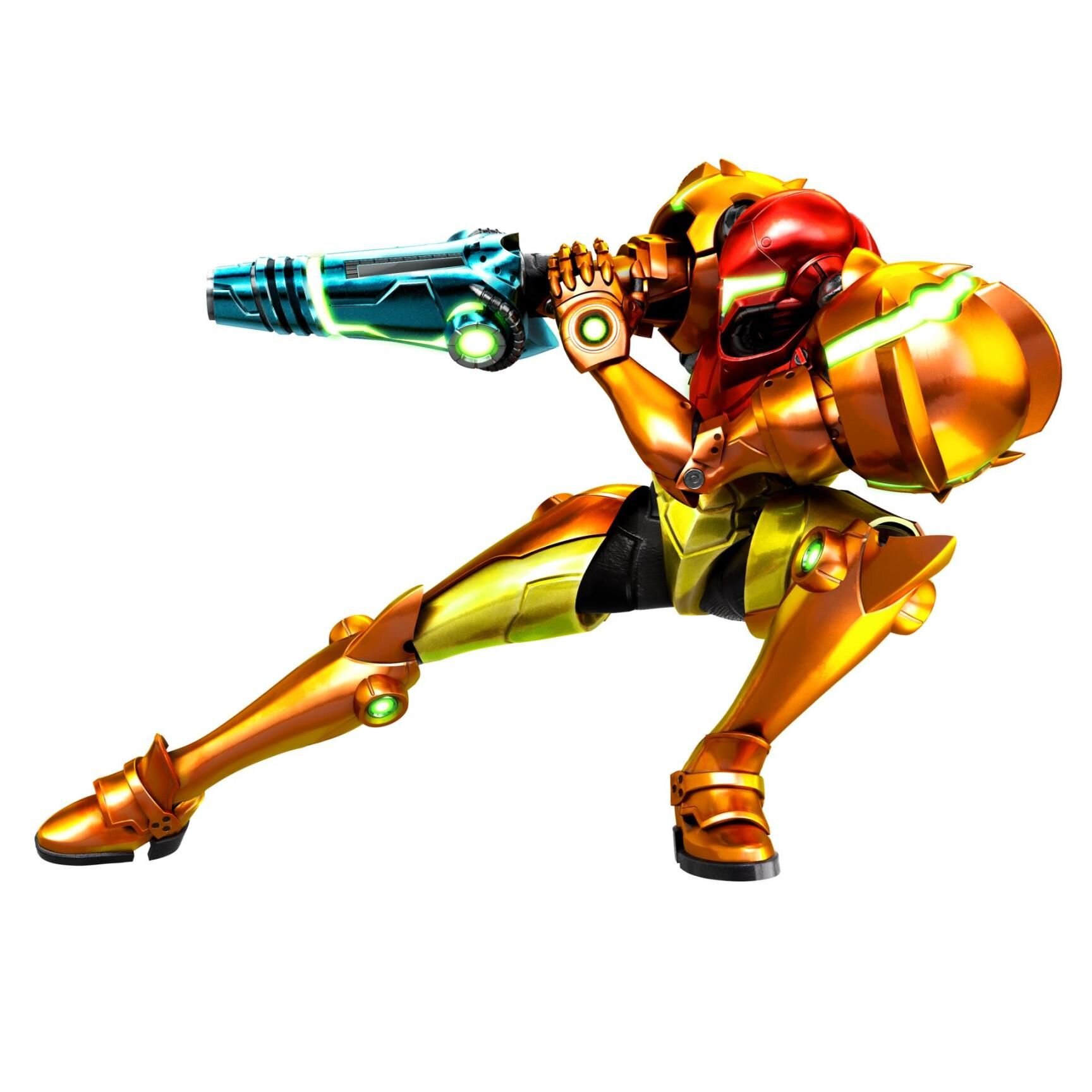


For Samus and Mega Man, their source of power is their arm cannon. For Klonoa, it’s a combination of his big flappy ears and the wind ring he carries.

For my own character, Jacqueline, from the game that Mark and I are making called Shackleton, her source of power is a giant key- her moveset and abilities revolve around use of it.
(But I filmed a bunch of our process from last month’s Backpack so that’s what you’ll see for physical products in the video)
For a lot of our characters, the idea of a source of power is a little more obtuse, because they’re simply running and jumping. Mario’s source of power isn’t his, mustache, or hat, it’s… his legs. But at least for that, overalls accentuate the body and legs, and put importance on the legs.
The idea of giving the character a source of power isn’t necessarily for us to understand everything about them just by looking at them (which tends to be a mistake in character design) it’s mainly for us to implicitly understand that what they do is something they’re capable of.
So let’s Design It!
Let’s bite off a little more than we can chew and design our character 3 or 4 times over. We are covering three progressive steps:
Drawing our character out.
Debuting him in his first game as a sprite.
Bringing him into a whole new generation on the N64 by making a low poly character model.
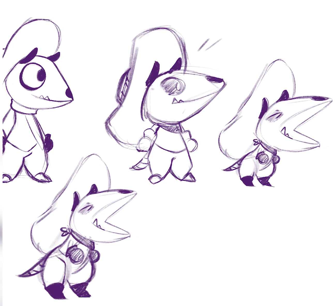
Our character starts with the simple concept of Possum Cowboy. Not only was it an intriguing concept to me, But a lot of the dark areas on a possum’s head seemed to mimic the abstract shape of a cow skull, so they easily went hand in hand. Our possum character’s source of power and main gameplay mechanic is a lasso that he swings over his head.
After some research into lasso throwing and understanding that timing is a huge factor, I thought the main gameplay loop would involve charging up more and more powerful spins of your lasso to grapple on to targets. For example, a giant bull character might need you to successfully stand still and spin your lasso 3 times before roping him. The lasso might glow, change color, or grow larger as you charge it up. While lasso throwing motions in real life seem to use the wrist to orbit the loop around your body, I thought for readability our possums gloved hand would orbit a somewhat stationary circle of the lasso, mainly for readability in our sprite.


I start with a simple 2D concept, and bring it into a pixel art application called Aseprite. I’m constantly zooming out to make sure that at 100%, my possum is readable. He stands only about 30 some pixels tall, the same as Sonic on the Genesis.
Game characters tend to occupy a square frame or bounding box, not an overly rectangular one in either direction, so that the game-feel of moving in any direction doesn’t feel cumbersome. The same way that we use line art to separate shapes out in drawings, a dark stroke around our sprite and between certain colors really helps our readability.
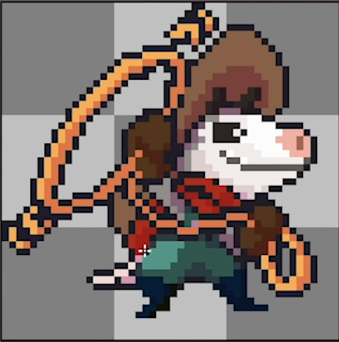
Now that we have an actual sprite, I bring this back into Procreate to make our ACTUAL character art, indulging in some of the very airbrush-y rendering that was common on Super Nintendo box art.

Our game is called O’Leary’s Gulch, starring the eponymous O’Leary (the name chosen for the O in ‘Opossum’, as well as the O-shape of the lasso, and the similar sound of ‘Lariat’ to ‘Leary’). O’Leary’s Gulch is the homestead he lives on, that he’s tasked with reclaiming from an outside force in-game. Stories tended to be incredibly simple in these games, so this simple, clear-cut motivation is all we need.
Now, O’Leary’s Gulch had a bit of a rocky transition into 3D.
Our next iteration on O’Leary was just a ridiculously fun exercise. As I’ve mentioned before, I have about 15 years experience with 3D work and have done 3D modeling in a professional capacity for studios. However my experience has mostly been in zBrush and Maya. That said, Blender is relatively new to me. Both the opportunity to learn more about the app and the simulation of inexperience that early 3D game artists no doubt had, with limited software and hardware, made this a really satisfying challenge.
The amount of polygons (or triangles) specifically in Nintendo 64 models like Mario were incredibly limited, and optimized down the last. The textures used were equally grainy and low resolution. I thought since our sprite was already made, it’d be fun to sample that for our model and UV map his surfaces to specific colors.

The final model is incredibly basic, and surprisingly may even be too advanced for that early hardware. Shapes like the ropes are simple boxy toroids, but the actual shapes are implied. We start to see what things are important in a retro game character design like this!
So if our in-game character is so low resolution, is there anything we can do to sell the illusion and character of O’Leary?! Well, let’s make him all over again! Why the heck not.
This next iteration of O’Leary brings us in to zBrush, and overall, I wanted to emulate the very early and primitive 3D renders from Nintendo 64 box art.
It was a new frontier for many of these artists. The art that they had to go off of probably left a lot for interpretation, and rendering and lighting was basic enough that there are these really washed out highlights and blooms, and odd colored shadows and ambient occlusion. All the while, really trying to sell the novelty of “It’s in 3D now! Wow! Isn’t that amazing?!” (And honestly, for those of us 90’s kids out there, it was a pretty big deal)
So despite having access to higher resolution tools in zBrush, I still want to use 3D shapes almost like amorphous clay shapes that are slapped together. The idea will be to sculpt O’Leary in pose, breaking through the box art and lassoing toward us.
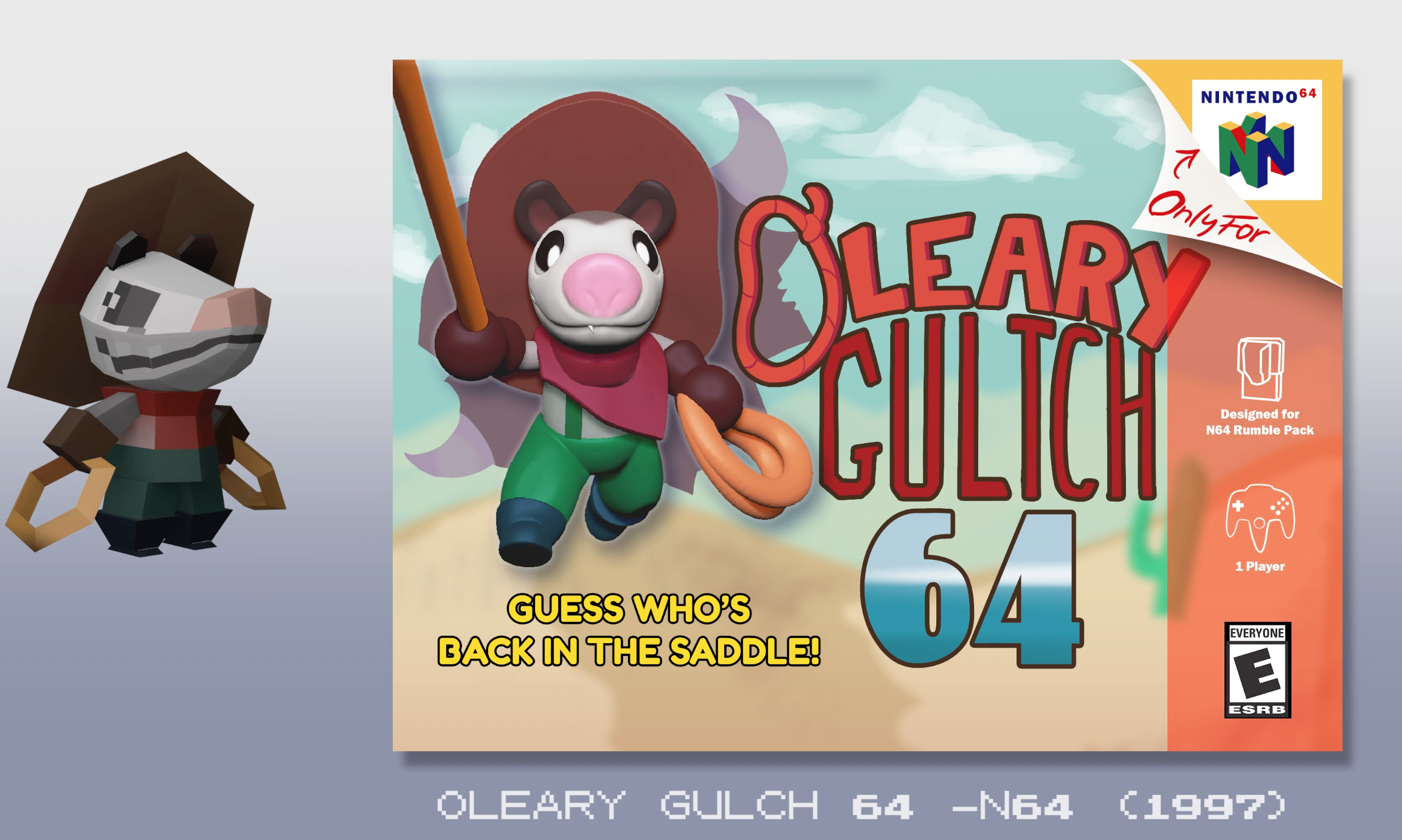
Super cheesy, but I’m loving every bit of it. Even the final colors are somewhat flat and not really going together! Even though this was a lot of work, it was a relatively quick turnaround and I only really worked off of my initial concept in isolation. Time has proven that designs improve through iteration.
As far as what we’ve learned from this, starting with a strong concept with clear shapes can give you a lot of mileage as you move through the process, even as you graduate to new mediums and contexts. Many of the most popular game characters have stayed relatively the same at their core through the years, and that’s thanks to iconic design and symbology.
Well that’s all, ropes— I mean, folks! What would you like to see tackled in the next Let’s Design Series? Let me know in the comments below! Character Design is so fun because each new purpose provides new challenges and considerations!
Also, make sure to sign up for our weekly newsletter and get the free Character Design Survival Guide, and exclusive stuff every week like:
Redesigns of old instagram art concepts
Tay’s 5 minute Story Tips
Downloadable PDF versions of our most popular Youtube Videos
Once a month live Q & A
and more—exclusive to newsletter subscribers only!
Thank you for reading and have fun creating!
Get this guy, just for subscribing!:

Want to perfect your character design concepts before you turn them into merchandise? Take the Learn Character Design Course and master the six pillars of iconic character design!

Hey! I’m Brookes Eggleston…
If you’re new here, welcome! I’ve worked in studio settings and in a freelance capacity as a Character Designer, Illustrator, Story Artist, and 3D Modeler for nearly 15 years. But what I love as much as drawing characters is sharing what I’ve learned. Get to know my mission here at Character Design Forge.