Clothes, props, companions, and even environments all say something about characters. And when it comes to the world of character design and storytelling, vehicles are no exception.
Let’s get into the mentality behind designing iconic vehicles from examples like Star Wars. More importantly, let’s learn how to design ships for your own characters by understanding the three elements of ship design: identity, utility, and visual read.
Watch this video now!
One of the most notable aspects of ships and vehicles from the Star Wars galaxy, especially the original trilogy, is just how purposefully mundane they are.
I’m not making any grand discoveries here, Luke’s first impression of the Millenium Falcon is— well, frankly, unimpressed.
And yet at the time, this was a big change from other ships in popular science fiction and fantasy films.
Common ships at this time carried the simplistic, smooth, and shiny alien look— like the saucer in The Day the Earth Stood Still or even the ship from Buck Rogers.
One thing that this does is contribute to the immersion of both the ship, character, and overall story.
The more lived-in and mundane something like a vehicle seems, the more it’s a part of everyday life.
The number of real-life references that Star Wars vehicles pull from— like fighter planes and such— not only make them feel familiar but the same ergonomics that make these vehicles useful to humans in real life are translated into this fictional world.
So let’s Talk About the 3 Elements of Vehicle Design
Identity:
What does the use of this vehicle say, explicitly or implicitly, about the character?
Utility:
What is the function and purpose of the vehicle? What is it capable of?
Visual Read:
How easy it to understand, at a glance or from far away, the shapes and design elements?
Doug Chiang, the head of creative direction for Lucasfilm, likes to talk about the simplicity of the bulk of Star Wars designs.
A TIE fighter from the front is an ‘H’ with a clear spot for a pilot, a hexagon from the side. The iconic sound instills dread, and quickly the idea of just how expendable these poor ships are becoming apparent.
For as fierce as an individual pilot might be, the Empire doesn’t mind simply throwing bodies at a problem. Identity, Visual Read, and Utility.
Here’s an example that most can probably appreciate right now, the most recent addition to the Star Wars vehicle canon has to be the Mandalorian’s ship, the Razorcrest.
So Let’s talk About how the Razorcrest Design Masters Two Identities at Once
(and what we can learn from it)
Like most Bounty Hunter ships in the Star Wars universe, it hits squarely in the middle of flashy and mundane. The utility for these characters far outweighs the intimidation factor.
Thinking about real life, many people love to salivate over lavish sports cars and aren’t likely to have as much of an appreciation for big industrial container ships (unless somehow they’re Maersk heads? ocean liner bois? container gang?)
The Razorcrest has all the elements of a classic Star Wars ship: it has shapes reminiscent of old planes and feels like something of a successor to the Republic Gunships from the Clone Wars (which, in fact, is the time period the ship was made).
The utility of the ship allows for extra cargo, passengers, areas where our characters can interact on board, but it also has what I can maybe posit is a really strong statement about the characters onboard.
Think for a second about a hotshot guy who loves sportscars, or is a prime candidate for that midlife crisis car purchase, but has a family and has to sell it— the sports car, not the kids— for a minivan.
Now, call me crazy but the Razorcrest reads like a flashy sportscar fighter for the first top 3rd of the vessel, with minivan essence dripping down its lower two-3rds.
And while he’s had the Razorcrest for longer, the Mandalorian’s newfound relationship with the Child makes for the perfect sportscar-minivan grafting metaphor. A character who has taken on additional passengers… of family.
Tell me there aren’t guys in minivans running stop signs on the way to dropping their kids off at school absolutely blasting the Mandalorian’s theme song.
Mando and Grogu’s amazing contrasting character dynamic is discussed in a video on my Youtube channel, where my wife Tay (and three-time science fiction and fantasy author) discusses the power of character relationships in storytelling. Check that video out here!
Let’s talk about Another Key Factor to Ship Design: Consistency
Another thing that Star Wars does: consistent specific shape motifs across entire factions.
For example, the Empire’s hard edges and sharp triangular shape language is contrasted by the Rebellion’s round and barrel shapes of the Tantive IV, Mon Calamari cruisers, and medical frigates.
You could view this simply as round shapes equals good guys, angular equals bad guys, but I think more accurately it reflects the underdog versus the dominant threat.
In the prequels, the Separatist armies, which have plenty of organic and streamlined shapes, while the republic carries the predecessor designs to what will eventually be the Empire.
Adapting elements from things that are not machinery, like creatures, is a well-trodden aspect of Star Wars design - It’s effective too. The foreboding or main traits of a creature can be read in a vehicle’s design, and help contribute to that sense of danger on our visual read.
In my course, Learn Character Design, an entire module discusses the fundamentals of design, which includes shape language. If you’re eager to improve your design skills and how to translate utility, identity, and visual read better, then check out this video lesson.
But more than just the Star Wars universe masters the grand challenge of vehicle design and shape language.
It’s Worth Noting the Master, Miyazaki, and his Use of Vehicle Storytelling:
We see themes and ideas being conveyed through the vehicles Miyazaki employs in his visual storytelling. His lifelong love of planes crops up frequently throughout his work.
Not only does flight provide an exhilarating feeling of freedom, but in films like The Wind Rises, a double-edged sword presents itself as a character’s love for planes easily becomes a tool for warfare.
So, When Designing Vehicles for your Own Characters and Stories, Consider these Questions:
What does a vehicle mean for your character? Does it bring freedom? Does it work smoothly? Does it need constant maintenance?
What does your character’s choice of vehicle mean for them?
Now Let’s Take what we’ve Learned and Make an Attempt at an Original Ship Design:
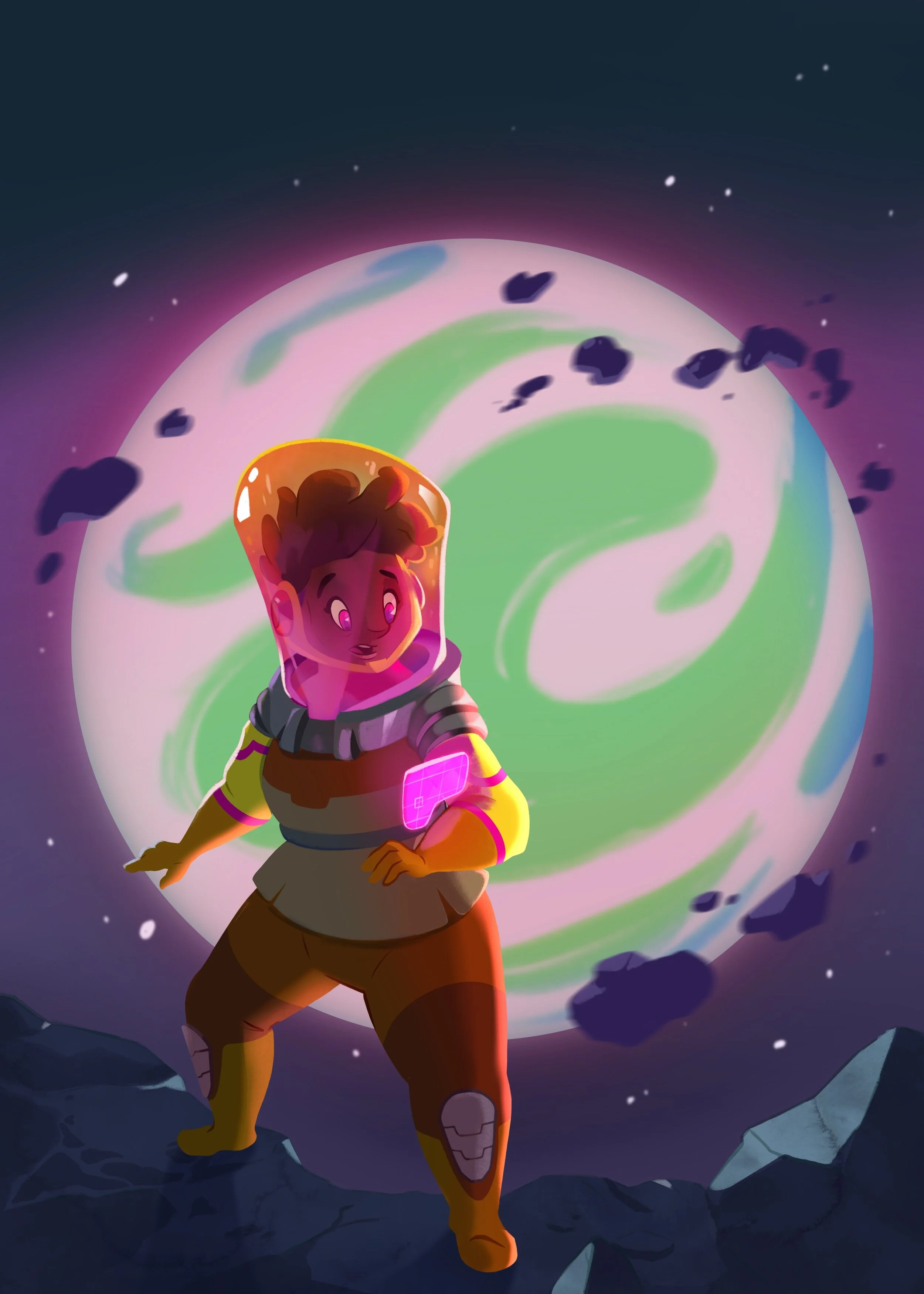
I have a spare character here named Laven that’s meant to leave the atmosphere, but no vessel to do so.
But before I start making endless silhouettes of ship shapes, I want to keep Identity and Utility in mind.
So Who is Laven?
She is absolutely a loner, she is happy to have some time to herself a planet away from any other people. She also has an adventurous and pioneering demeanor for her to be the absolute first person that she knows of successfully entering space, and she should be eager to explore.
So, for utility, we want her ship to have enough size for a living space inside, and we want it to look like leaving the atmosphere was hard for it to do.
Here is Laven’s Ultimate Ship Design!
If you’re familiar with my work you’ll know I don’t often talk about ship or vehicle design— I’m definitely more of a character-design-focused and storytelling guy— but this opens our minds to just how much a vehicle tells a story: about your character and your world, and why it needs to be utilized more in design.
If you’re a fan of Laven, check out the special merch you can proudly don, as featured in the October Biko’s Backpack!
What ships or vehicle designs have always stood out to you and why? What do they tell you about the character?
Let me know in the comments section below, I’d love to hear what inspires you!
Do you Want to Master your Digital Art and Character Design Skills?
You Can Do it in Just Six Steps
Hey! I’m Brookes Eggleston…
If you’re new here, welcome! I’ve worked in studio settings and in a freelance capacity as a Character Designer, Illustrator, Story Artist, and 3D Modeler for nearly 15 years. But what I love as much as drawing characters is sharing what I’ve learned. Get to know my mission here at Character Design Forge.
