Pop quiz— or, I guess, pop question: What are 3 words you’d use to describe your aesthetic?
And I’m talking about either the work you make or the stuff you like. I’m curious to learn your answers! Why not write them down now, and maybe after this article see if your choices change or if you understand why you chose those words a bit more?
Watch this video now!
The “Aesthetic” Conundrum
First, let’s get a lot of the funny/common ideas about “aesthetic” out of the way.
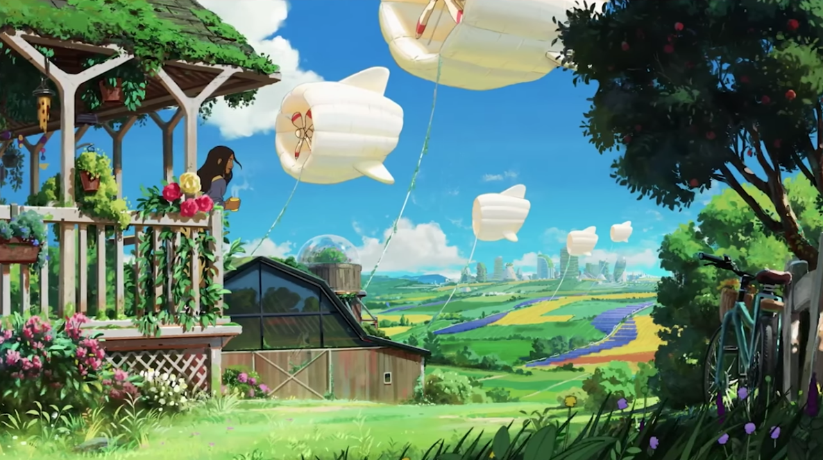
Now, aesthetic COULD be vaporwave, digitally artifacted pink sunsets with an 80’s motif, it could be odd liminal spaces of abandoned malls from the 90’s, or washed out pastel colors surrounded with plantlife and accented with gold— but it also doesn’t have to be at all.

Finding Your Style vs. Interpreting it to Others
It’s actually super helpful for us to think about aesthetic and how others will interpret your work because it could be the inherent value to them wanting to engage with your work at all.
At any point or time when someone claims that something IS aesthetic or something is THEIR aesthetic, it’s because it connects with what feels like their identity or a prevailing undercurrent of mood that speaks to them.
“Style” is something a lot of people try to figure out for themselves, and as we’ve talked about a lot before, they usually do so prematurely.
What I’ve always advocated for instead is to find your artistic voice, the things you’re trying to say instead of just the way that you say them. Why? because style is downstream of voice.
(Psst! Watch my video Forget Art Style— Find your Artistic Voice here!)
Further downstream from style, you’ll find Aesthetic. It’s a visceral underlayer to something, it’s the meaning that’s found by the one who observes it.
Something being represented in a pixel art style will immediately read as a retro or indie game aesthetic to a lot of people, but the reason for that is their personal connection and memories. Something being in “pixel art” doesn’t inherently mean it’s supposed to be video game related.
In certain ways, it’s impossible for you to control how someone else interprets or finds meaning in your work. But you can guide it like bumpers in a bowling alley.
So if someone says something is “THEIR Aesthetic”, it’s a sort of aspirational underlayer to the person looking at it, to a point that affects their identity.
This could mean other artists want to make work that either looks or FEELS like yours. Or it could simply be that a fan enjoys or finds meaning in something you made because of how it makes them feel.
It could make them want to hang your work up in their space as a sort of ornamental value, or as part of the space they’re trying to craft for themselves.
This includes putting your art on their wall, making it the backdrop on their phone or computer, putting your sticker on something they use every day, or putting a pin of yours on their bag.


Grab original merch from our monthly subscription pack: Biko’s Backpack
It could even be them creating fan art or work based on your art because it inspired them to do so.
Most of us see that as a resounding success of our work. So how do we get there? Let’s talk about 6 ways that we can raise those bumpers in the bowling alley and maybe even make the lane a little thinner.
Your Artistic Voice
At the top, the most potent thing is that artistic voice— AKA all the things you’re trying to say.
That means a reflection of your values— things that matter and are special to you, the kind of work or feeling you want to see more of. It’s a little bit like your personal aesthetic, but it doesn’t always translate 1 to 1, especially when you’re just starting out.
There’s a pretty good example of this leaking through when you don’t intend it to, and it’s when it’s clear that an artist essentially has contempt for the subject matter they’re drawing, there will be a dismissive and reducing quality to the work.
On the flip side though, something you care a lot about is naturally going to gather like-minded people as fans. Do you love frogs and drawing frogs? You’ll likely attract some frog likin’ people. Do you love nature reclaiming things, or man-made buildings and places getting overgrown by foliage? You’re going to gather some people that feel the same.

It also comes across in practical ways. Are you someone who could care less about the building you’re drawing, but will painstakingly craft the foliage that’s growing over it? Those plants are going to read either stronger or more important.
I think empathy is a quality that character designers could benefit from applying because you get a feeling for how the artist feels about or connects with the character through the way they represent them.
I think you can tell quite a bit about where an artist’s mind was or is in general by looking at something they’ve made, especially from artists that are more experienced in their field.

On the other hand, a feeling I tend to get when looking at beginner’s art is an immediate transport back to the time and age when I was figuring things out in art.
You can see it in the limited understanding or skill level in the work, the ambition to make something more than they’re capable of.
It’s an aesthetic that that beginner can’t help but communicate, but it probably is only meaningful in that way to other artists that are more skilled or experienced than them who remember their own time in that range.
If you’re unsure of your artistic voice, or it feels like it needs to be updated (which everyone should do from time to time) Try to figure out the unifying things and patterns across the work that you like, and the work you’ve made.
Try to dig a little deeper into why it is you like those things and be plenty personal and honest with yourself. All of that is going to flow downstream into aesthetic.
(Struggling to refine your design skills? Check out Module 3: Design from the Learn Character Design course. In this module we break down the concepts of design, how to practically create characters using these principles, and create several thesis characters based off of various styles of character design through history.)
What are some more practical ways to establish aesthetic? Let’s get into that with point two.
2. Theme
You could be surface level, almost pandering- “This one goes out to all the moms out there!” Well I either am a mom or love my mom. You’ve now appealed to a particular group (and a rather large one at that).
Most successful aesthetics allow that message or statement to reside under the surface, almost like a theme.
In a film, whether or not a theme is explicitly stated by a character, a good theme in a good film is one that’s supported by the rest of the story.
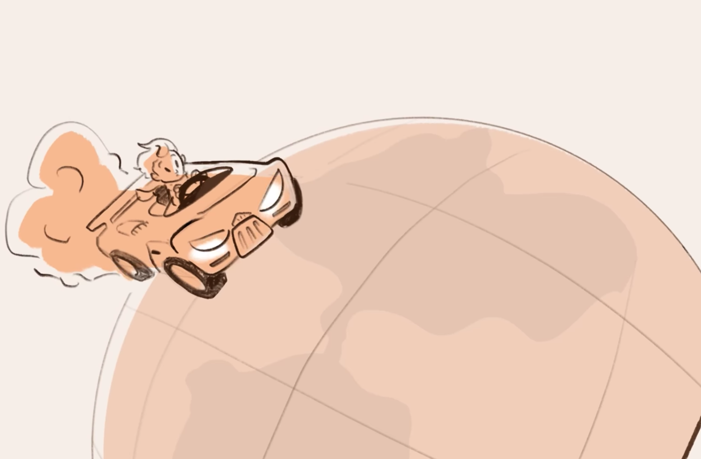
If I had a story about a lone race car driver making a trip around the world, and at one point a character said, “We’ll always be there for you, that’s what family’s all about”, despite no other part of the story being about family or even the absence of family, it doesn’t work as a theme.

To impart a theme or value through an aesthetic, it may be more helpful for you to know what you’re trying to say, but never explicitly say it.
(Need help refining your storytelling skills? Check out Module 2: Story from the Learn Character Design course. In this module, we examine the underlying parts that contribute to stories, personalities, lore, and character arcs, so that your characters can be supported by a good story that moves people.)
Going back to that nature reclaiming idea, you might shy away from an almost political cartoon-level of setup where an evil businessman is pouring pollution into the water while a teddy bear stands by crying. Instead, you can simply show how nice it would be to have less industrialization in the world or a setting that’s calm and free of those things.

VS.
In the same way that we tend to enjoy discovering music on our own vs someone telling us “you’re going to love it!” your potential audience will enjoy connecting the dots on their own without you spelling things out.
That’s what good humor does and explaining the punchline lessens it. In order to cause someone to feel like this work reflects or supports that part of their identity that fits their aesthetic, leaving room for them to connect the dots strengthens that process.
3. Genre
Genre is simply organizing familiarity.
Rango and Once Upon a Time in the West are both westerns with some similar trappings but drastically different intents and meanings and therefore, very different aesthetics.

Genre might initially attract someone to your work because of the familiarity, but you’ll need to strike a stronger chord with them to get them to stay.
Of course, there are people who are just into ALL westerns and ONLY westerns, but more people just appreciate a good piece of art or story, no matter the genre.
Often times genre will be tied to certain technical limitations, eras, or mediums.
For example, when we talked about pixel art, that’s representative of technical limitations of a certain era that we still use today because of its appeal, ease of use, and nostalgia. Westerns often employ horses because planes weren’t invented yet…. (Just seeing if you were paying attention.) :)
Adopting the trappings, common elements, and familiar things associated with a genre draw work like a magnet towards certain aesthetics and help tie it to something that people recognize.
If you’re building a personal aesthetic, or are trying to strengthen something that’s unique to you, see what ways you can anchor or ground your work by tying it to things common in a genre. Sometimes all you need is that specificity.
4. Consistency
This might be a little obvious, especially given what we’ve already talked about with theme, but consistency is a huge factor in establishing an aesthetic.
How many times have you heard one song by an artist only to find that none of their other music sounds that way? Someone might be drawn to an individual piece of your work for any given reason but turned away once they see that overall, your work is a smattering of way too much stuff without any unifying factors.
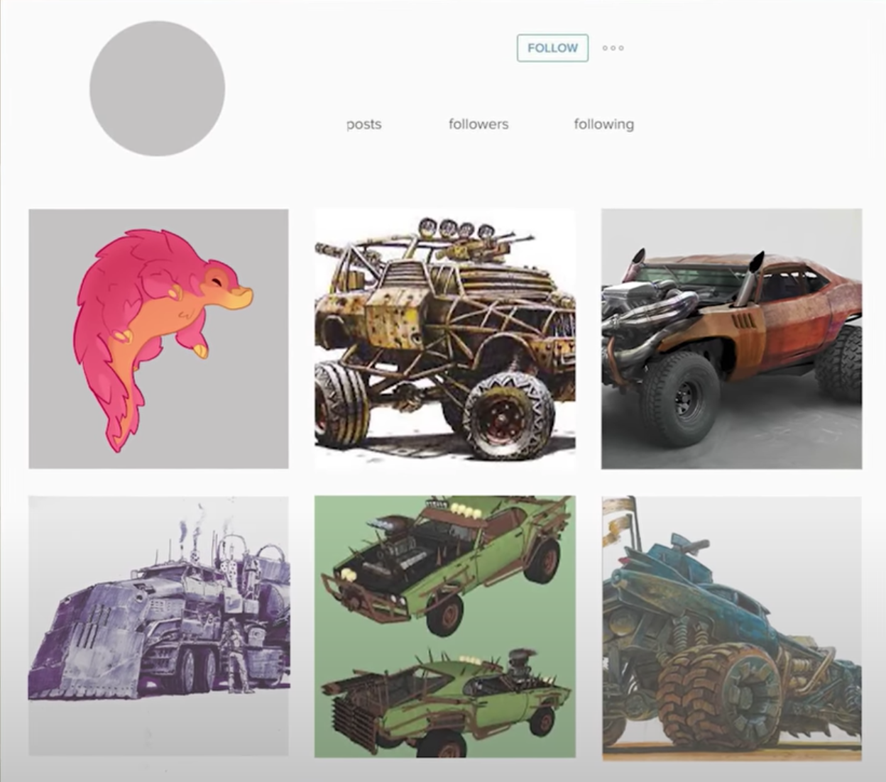
We’ll use the Instagram page as an example. If you went to someone’s profile after seeing a really cool creature design only to find the rest of their work is consistently post-apocalyptic vehicles you’re less likely to follow them.
This shouldn’t limit you, and adhering to specific consistent elements just for the sake of it might even stifle your creative growth. But if it feels like there isn’t a general vibe people could describe your work with, it might help to hone things down a bit, or try to specialize a little more.
5. Color
Now, this one is a little tough for a few reasons. First of all, all color is based on value, how light or dark something is, and choosing local colors for things in something like an illustration, without thinking about value or what it does to the image can just make for a poor look.
(Learn more about the power of color in my video How to Use Color in Character Design and, Like, Know what you’re Doing)
Using color in illustration or in comics is not the same as picking colors for a logo, they’re far more relative. But in terms of something like branding, and the way that you typically render things, that same idea of the super cohesive Instagram page is really appealing, and usually makes someone recognize that a piece of art was made by you before confirming that it is.
For me, I don’t really limit myself to a set palette. However, in doing some exploration, I found that some of the colors I use the most in characters are light yellow, bright orange, pale green, pastel pink, and of course, magenta skewed purple.

Looking at these colors all together gives ME a strong feeling of meaning, and makes me feel like I’m going in the direction with my work. For someone observing it, hopefully, a similar amount of that feeling comes across if they connect with it.
6. Composition
This might seem minor, but composition contributes a lot to an aesthetic, just the same way it does in, say, interior design.
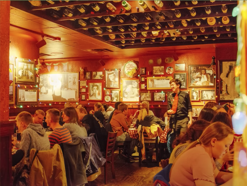
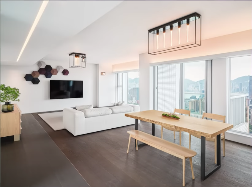
There’s a very different feeling between the maximalist, gaudy and cluttered walls of Buca de Bepo and a stark, minimalist apartment with maybe a piece of furniture and one picture on the wall.
Look at the difference between an Instagram profile, (yes, we’re going back to that again) with the same character art, but presented minimally and presented in a cluttered frenzy.


This will come back to the method and process you’re using while making work, are you trying to fill in every space, or do you want to let it breathe? That’s going to contribute to an aesthetic just as much.
Keep in mind that aesthetic being tied so much to personal identity means that you’re going to alienate or put off just as many people as you’re attracting to your work, and that’s actually really good.
It’s that age-old truism at play: instead of trying to appeal to everybody and resonating with no one, you’re trying to hone down to a niche group who will really appreciate, and subsequently support, your work.
I don’t think you should be hyper-focused on creating things that adhere to a specific aesthetic. More like, every couple of months or years, look at your work overall and see if you’re steering in the right direction.
Because our caterpillar is so abstract compared to the real thing, we get away with a ton of elasticity, and we get a character who can emote and do goofy things without us going “that’s weird, its eyes just got bigger”.
There’s absolutely some nuance here, being able to redraw something consistently comes with a certain level of drawing understanding and experience.
The more realism your drawing is representing, the less wiggle room you have for this exaggeration. All that being said, some really appealing and engaging work comes from using these principles in your art.
And as we’ve been showing with our caterpillar, it starts in the design process. I personally like to create characters that are simpler and more elastic to allow for this amount of squash and stretch and exaggeration.
Think about the PURPOSE (which we talk about constantly) of your character when designing.
If it’s going to move and act or emote, like a comic or animation, design for movement and emotion. Build that wiggle room in, the same way that a puppet builder BUILDS in a functional mouth or set of eyebrows.
All of our exploration of how far we could push the shapes through expressions at the beginning, and refining those shapes, lead to a character that served the purpose better.
So I’m curious… did your three words change or suddenly become much clearer? Whatever they were, I invite you to share them below and explain why those three words embody your aesthetic.
Do you Want to Master your Digital Art and Character Design Skills?
Take the online course that has helped countless students master basic and advanced character design techniques.
Available Now!


Welcome to the Forge!
If you’re new here, get to know our mission here at Character Design Forge and start designing your best characters yet.