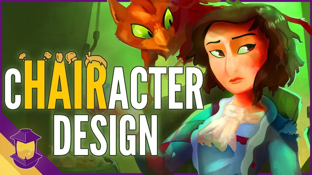
So you want to elevate your character art skills. What should you do? Here are four lessons you can learn from right now to improve your character design skills immediately!
Use value and color to your advantage
2. Don’t get all hung up on accuracy (instead, rely on principles!)
3. Focus your character’s gestures
4. Use light to your advantage
What do these four lessons mean? Don’t fret—I'mma break it down for you right now!
If there’s one big lesson that I’ve been continuously relearning this year, it’s that there’s a big difference, functionally, between character design and character illustration— at least in terms of how you approach it and what your goal is.
You may be drawing the same character, you may be doing visual storytelling with both, but different things are important. It’s like the difference between writing lyrics and then singing those lyrics. They’re both part of the same song, but they’re different activities, maybe even being done by two different people, one who can’t write and one who can’t sing.
There’s four illustrations that I’ve made in the past month, featuring the cast from our cast design series (as seen above), that each have their own lesson to teach when it comes to illustration. Because after you’ve done all the work of creating your character, drawing them, iterating on them, don’t you want to show them off in the best way possible?
Obviously we talk a lot about character design on this blog and there’s a lot of overlap between character design and illustration. But if we were to talk the difference between them: the design would be the actor, Paul Rudd, and the Illustration would be the film Paul Rudd Goes to CVS. An illustration is a great way to tell a story, to set a scene, to give context, and give your audience a compelling idea about your character. It’s one thing to show a cardboard cutout of Paul Rudd to people and just insist that he’s a really great actor, but it’s only once they’ve watched the Oscar winning film Paul Rudd Goes to CVS that they can really be invested (with tears streaming down their face, I might add).
So illustrations need to have a purpose. The question that you always need to ask is: What is Your Quest?
What is your purpose for this exact illustration? Maybe you’ll say, “I want or need to showcase the character doing this!” or “I want the mood to be this!” or even “I need this printed on something that’s these dimensions so I need to make it look like this”. Constantly going back to the motive and purpose for your illustration will always make it better. It will also keep you from drawing pointless little houses on the mountain behind your character that would otherwise contribute nothing to your illustration.
So let’s talk examples. Up first is an illustration that needs no background at all, because its purpose is to be a sticker:

Glangor, here, is this bulky crab creature who acts as a tank of sorts in our party of characters. Speaking of purpose, another purpose of the Glangor sticker is for it to fall in line cohesively with another sticker Ive already made of the other character featured here, Biko. So that goal alone dictates the size, style, and level of detail I create with this iteration of Glangor. Of course, you can see the design that I started with on the left there, of Glangor simply standing still, but our illustration needs to have a dynamic running pose.
LESSON 1: Use Value and Color to Your Advantage
Value (how light or dark something is) is king when it comes to illustrations. Of course, all colors have value, and when you have contrasting values next to each other they call attention to themselves, and similar values tend to blend together. If we create a grey color layer, in almost any art app, we can quickly check our values without them being affected by the hue or saturation. For example, in the final Glangor illustration here, we can see that the eyes are the darkest things here, surrounding by relatively light values, so our eye is drawn there, which is good:

Most of the important segments of him are decently distinct from one another, which is also good. The forward knee and the back hand, which tell us a lot about the running motion, are both easily visible, so we’re looking pretty good.
One thing we haven’t talked about before is using a similar grey layer like the one in Procreate called luminosity. This shows us a color map of what’s really saturated in our color, removed of the value. We can see that the forward arm and the main portion of Glangor’s shell are what’s drawing the most attention, and that the blue from his clothing helps segment things out as well.

Don’t be afraid to modify and change the colors in your illustration even if they aren’t “accurate”. Look, if it’s going to help the clarity and storytelling— modify away! To sum this section up: use Color and Value to your advantage. Check them individually to make sure things aren’t too muddy or sharply contrasted.
LESSON 2: Don’t Fret Over Accuracy
Once again, color value is super important in what we’re communicating. But there’s another lesson from a planning side of things that I know, at least for me, can trip a person up if they’re overthinking it. That lesson is that there are things more important than accuracy in an illustration. YES—believe it or not!
Maybe this happens to you too, but there’s times where I actually trip myself up worrying about the length of someone’s arm, or what shape something is from a specific angle. These things are great to keep in mind when designing characters, and if you’re still learning art basics, get into the habit of making sure your proportions are correct.
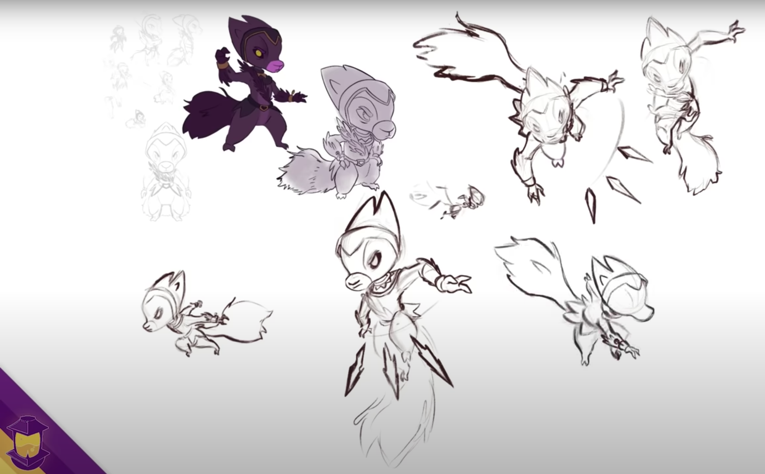
But take this print of my character Aecious here as an example:

In the original design, the character’s arms don’t reach the mask on top of his head, and the shape of his arms in the illustration isn’t that compelling. This is something that I probably would have solved by continuing to do more pose drawings of the character in action. But the illustration benefits from his arm being able to reach the mask, and from the elbow and hand having those sharp angles. This kind of comes full circle, where you’ve designed a character that moves in 3 dimensions, but right now, the important thing is the 2 dimensional silhouette shape that the character makes.
A little bit confusing? Sure! But look, it really helps not to bind yourself to hard and fast art rules in these situations and instead rely on principles, and ultimately, what’s going to look best. The “correct” thing for me to do in this situation would have been to maybe hunch the head down so that it could reach the hands, but then you’d lose the nice tall arc in the neck, and the confidence the character gives off.
To wrap this lesson up in a few words: exaggerate and check your silhouettes, and don’t get too hung up on rules you’ve made for yourself.
LESSON 3: Focus Your Gestures
For the third illustration and lesson, we have Biko, my main character:

The purpose of this illustration was experimental. I wanted to improve my gesture and work on rendering something in Gouache. And the lesson here from the beginning is all about gesture. Notice that there’s one really strong arc throughout Biko here, and every part of him is reacting to it. Not only is it smooth and tense on one side, but the opposite is happening on the other side, lots of complicated bumps and creases to contrast the other side. I aimed to base everything here off of that one motion.
If you’ve got an existing character, try to choose a pose that plays well to their existing shapes, and draw everything to support that pose. Start small with large strokes in your sketch so that it’s easier to control the overarching shapes and motion. Again, check the silhouette, and break things in order to aid the gesture.
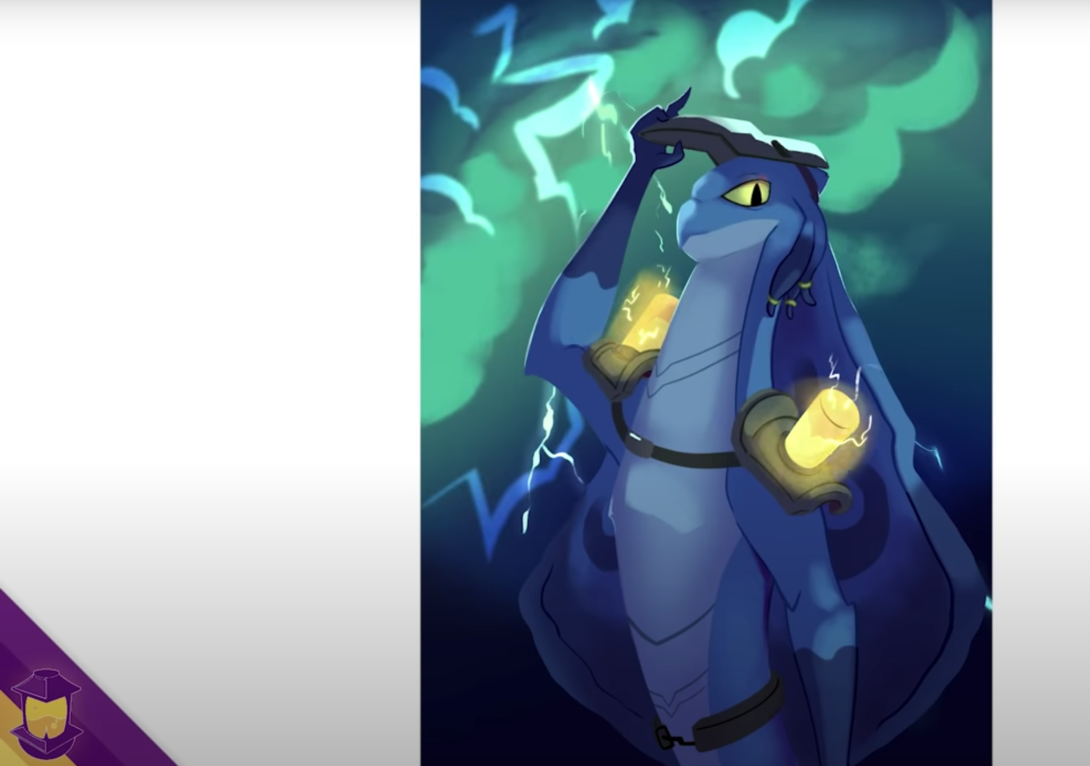
LESSON 4: Use Light to your Advantage
Finally, we have an illustration of my favorite character from Biko’s supporting cast, Quilver:
Quilver is a marksman shooting his own quills, and I wanted a really dynamic pose with perspective and depth. Almost a continuation of our Glangor lesson about value and color, and our Aescious lesson about rule following, one of my favorite things with this Quilver illustration has to do with using light to our advantage, and messing with what might be the “rules” of color in our illustration.

By adding the blue rim light, fading certain elements like the back leg and arm with blue mist, Quilver pops with dimension, and the strongest motions of his pose come through. That, along with the quills coming at us, makes for a really layered, dynamic illustration.
So if you’re worried about “accurate” lighting, remember that you can bend the light to work for you, including rim light, atmosphere, and blur. And definitely use colors other than a lighter and darker version of your character’s colors to light and render. Keep in mind too, that with all of these illustrations, even though they aren’t completely flat images, they aren’t exactly rendered with the depth or accuracy of something photorealistic, but they still get across what I want them to. So don’t be afraid that an illustration has to be painted so intensely that it takes 40 hours of rendering before you can even think about being done.
So, there you have it. Take these four lessons with you and run with them. Elevate your character right now by:
Using value and color to your advantage
2. Refusing to get all hung up on accuracy (instead rely on principles!)
3. Focusing his gestures
4. Using light to your advantage
Interested in following Biko and his friends on their journey? 3 out of the 4 of these illustrations ended up in this month’s installment of Biko’s Backpack, a monthly delivery of new original art delivered right to your door. Check those out and keep the Forge burning at the Biko’s Backpack tier on patreon.com/bageldenizen.
Thank you for reading and have fun creating!
Check out Biko’s Backpack This Month!:
Aecious, Biko, Quilver and Glangor are all featured in Biko’s Backpack this month in the form of pins, stickers, prints, collectible cards and more! Get this indomitable crew delivered right to your door now.


Hey, I’m Brookes Eggleston!
If you’re new here, welcome! I’ve worked in studio settings and in a freelance capacity as a Character Designer, Illustrator, Story Artist, and 3D Modeler for nearly 15 years.
But what I love as much as drawing characters is sharing what I’ve learned. Get to know my mission here at Character Design Forge.
Latest Articles:


Procreate Dreams launched today, but before you start working with it, there are just a few quick things I want to help you understand so you can get animating. The flip side of an app that’s really revolutionary with its approach to animation is that revolutionary means it’s going to be different. Because everyone is so excited to jump into this, I just want to help you navigate the app, since it’s not laid out like any other animation app I’ve used before!