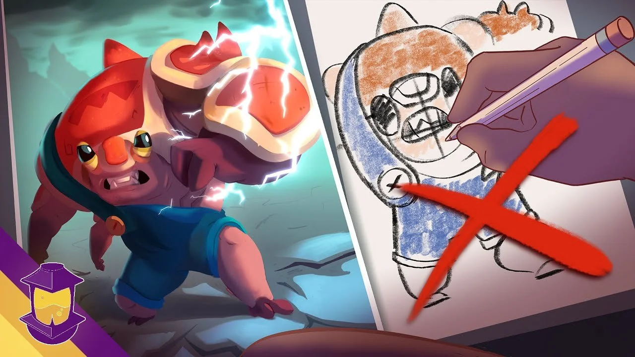
Whether we’ve drawn our characters, written about them, or they haven’t left our head yet, we’d prefer that people care about our characters. But how do we do it? How do we make people care? By making your characters more engaging, or exciting to your audience. And there are 4 key ways to make your character more exciting:
Raise the stakes (or lower your character’s ability to meet them)
Clarify your Concept
Twist of lime— 70/30, 80/20
Juxtapose
What do each of these methods entail? Well today I’m dissecting each method and how you can utilize them in your character design concepts. So let’s get to it!
1. Raise the Stakes (or Lower Your Character’s Ability to meet them!)
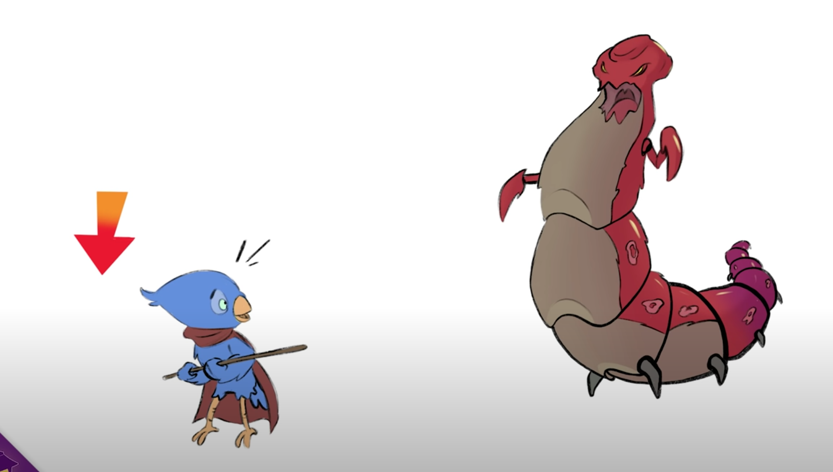
If you’ve ever watched people, dogs or horses jumping hurdles, literally the higher the obstacle is, the more invested and impressed we are by their ability to overcome them. But this goes both ways: we’re impressed by a horse who can clear a 10 foot jump but we’re equally impressed by a koala that can clear a 5 foot jump (or stay awake longer than an hour).
So, increase the challenge of the obstacle you character faces, or lower their ability to accomplish it. It can be a physical, mental, or emotional disparity between your character and their goals. But the idea is, the more struggle there is, the more exciting the scenario becomes.
2. Clarify Your Concept
Have you ever had to be on the receiving end of a bad joke? I mean a really bad joke? You know the long, seemingly aimless joke with lots of extraneous details? The kind that when it finally reaches the punch line you say… wait, that’s it?! So the can of tennis balls, the bridge over the stream, and the flyswatter didn’t matter? Being on the receiving end of an over complicated character can end in the same reaction!
From a storytelling perspective, it benefits your character to be simplified. Now, of course, we don’t want our characters to be one note stereotypes. But as much as there’s a lot of good advice advocating that your characters be as complicated as “real people”, such unnecessary complexity could actually muddle anything meaningful we’re trying to say through our character.
From a visual perspective, if there’s too many elements, too many conflicting shapes or colors, or anything unclear about your character, it may serve you better to go back to your core idea of who your character is, what purpose they serve, and figure out what things to streamline.
Take this character here: is it an astronaut? a deep sea diver? someone in a hazmat suit?
If we want to clarify, we streamline the elements down to a clearer concept. Like so:
Now, I just want to point out that there are ways of making the previous character work. There’s some characters who play on this gimmick of mish-mashed parts such as XL from Buzz Lightyear of Star Command and (if I really want to age myself here) Lockdown from Transformers.
The key here, though, is there’s a tendency (especially amongst newer artists) that with the latter character— well, he just isn’t special enough! But one of the keys to making something exciting is that an audience first needs to get invested in a character, and they can’t do that if the character is hard to discern. The faster they can get a read, the faster and easier it will be for them to care.
3. Twist of Lime 70/30 80/20
It’s hard to excite people by showing them things that are already familiar. A knight in shining armor? Yep, we got it. A teenager going through a rough emotional time? Maybe relatable for your audience, but heavily treaded ground.
But all it takes is something small: an interesting idea, a tiny twist or complication to take an idea we’re familiar with and make it exciting.
A knight in shining armor that’s actually a young dragon in disguise: the dragon ends up being the defender of a medieval kingdom, but must eventually go up against his own family! Or, a struggling teen gains the power to select which emotions they feel: do they shut themselves off or learn a lesson about facing them head on?
In storytelling, we call this the hook— the interesting twist that catches our interest.
From a visual perspective, this 70/30 or 80/20 percentage quite literally translates into contrasting shapes, elements or colors. A palette made up of mostly brown and green earthy tones will get accentuated by a relatively bright red thrown in. Or a character that’s pretty consistently themed after a certain era, theme, or setting, but has an item or feature that just doesn’t fit:
On a purely shape-based level, taking a character that is homogeneously comprised of certain shapes, like round shapes, and carving a portion of them with angles in contrast, adds a very fundamental interest and excitement to the character.
4. Juxtapose
Juxtapose means “to place or deal with close together for contrasting effect”. You needn’t look any further than salted caramel to understand that juxtaposing two opposites together can be an interesting new idea. Opposites attract, or in our case, add a spice of which variety in life!
Here we have an adorable Animal Crossing-esque hamster character and things seem to be all going to plan:
But if we juxtapose him into a dystopian environment, we start asking some questions. Is this indomitable little hamster simply unfazed by his surroundings? Is there a dark edge to him, and looks are simply deceiving?
We can do the same with a secondary character, because the difference between these two is ripe for interesting ways to play off each other. Visually this character could match them in style and tone, or not, match them, in style and tone:
Naturally, we all want people to care about the characters and stories we make. It’s validating to make that connection. Of course there’s plenty more to dig deeper on in the realms of drawing, design, and story, which we talk about every week here on Character Design Forge.
But if you want to create a character that is more exciting visually and story-wise, remember to:
Raise the stakes (or lower your character’s ability to meet them)
Clarify your Concept
Twist of lime— 70/30, 80/20
Juxtapose
Your characters can thrill your audiences. Don’t give up! Work hard at their concepts and you can design amazing characters. Thank you for reading and have fun creating!
Hey, I’m Brookes Eggleston!
If you’re new here, welcome! I’ve worked in studio settings and in a freelance capacity as a Character Designer, Illustrator, Story Artist, and 3D Modeler for nearly 15 years.
But what I love as much as drawing characters is sharing what I’ve learned. Get to know my mission here at Character Design Forge.
The Learn Character Design Course
I’ve created this dynamic online course with the goal of helping novice artists understand the fundamentals of great character design. Get ten in-depth video lessons full of fantastic resources right at your fingertips!
Similar Articles:
Check Out What’s in Biko’s Backpack This Month!
Get original character design merchandise from Brookes Eggleston delivered to your door every month!


Procreate Dreams launched today, but before you start working with it, there are just a few quick things I want to help you understand so you can get animating. The flip side of an app that’s really revolutionary with its approach to animation is that revolutionary means it’s going to be different. Because everyone is so excited to jump into this, I just want to help you navigate the app, since it’s not laid out like any other animation app I’ve used before!