What a complicated sandwich we are piling together when we try to design fantasy races and factions.
There are many things that you need to consider if you want your fantasy race or faction to come out fully baked. Lore and background, story and culture, and more all contribute to a unified or harmonious look.
However, you don’t want your group to be SO harmonious that they all look alike.
So how do you successfully create unique yet unified races and factions for your fantasy culture?
Worry not, friend. I’ve outlined a sustainable process, offered best practices, as well as provided powerful steps on how to achieve this very goal.
Watch this video now:
Let’s Talk About Purpose
Design is always done with the aim to fill a purpose. Another way to say that is, design solves a problem.
When it comes to designing a race or faction, this has two different meanings:
For your story or premise: displaying the purpose or point of this group.
For the race or faction themselves: understanding what they’re like through the problems they solve.
For example, the problem that the Fremen of Arrakis deal with in Dune is a lack of water on a parched desert planet. So they’ve built still suits, AKA: enclosures for their bodies hooked up to their nostrils which collect any moisture that they expend.
That’s their visual design. Their culture is defined by and obsessed with salvaging water— even calling the act of shedding tears when someone dies “giving water to the dead”. Still, they hold out hope that the planet they live on can be more sustainable and even green again.
There’s a ton more nuance that can be extracted from this, but already we see the path of their situation branching off. Culture, ideals, problems, and more are answered in this unique design (and that’s not even getting into the effects of the spice Melange).
This is one of the great benefits of a sci-fi or fantasy scenario. So much can be heightened and wielded to make a point and impression.
Let’s Talk About Message
Since all characters are inherently human, (since we, as humans, are the ones making them) there’s typically a contrast and message in place.
What makes this group or species different from humans, or from people from another planet or region? What makes them more admirable than us? Or what flaw do they have that tells us something about the darker side of humankind?
So here are some more questions to ask about your story and premise of your race or faction (all aimed to help you strengthen your ideas):
Is this race or faction more noble and enlightened than humans here on earth, or perhaps more animalistic and primal? Are they even sentient?
What is the key difference between their lives and ours?
What is the biggest challenge this group faces?
What do they hope for the most?
What is this race or factions’ largest philosophical flaw, blind spot, or lesson they need to learn?
Let’s Talk About Visual Design
Visual signifiers are all going to stem from what you know about this group, whether they’re human and you’re designing the way they dress, or they’re not human and you’re designing their biology (or heck, even a little of both).
Two huge aids with this are COLOR and SHAPE. And we can break both of these things down a little further.
Shape language is something we’ve talked about in-depth in the past. (In fact, if you need some basic shape language tips, watch my starter video Intro to Shape Language!)
Shapes imply things about characters.
Chunky, blocky shapes might imply a brutish or stalwart group:
Long, curly shapes might imply an elegant or enlightened group:
And sharp, angular shapes might imply a ruthless group:
You can apply this either to the actual design of the people or the designs that the people themselves make. That’s what makes this such a layered process, you’re getting into the mind of the people you’ve made and using their hands (or tentacles) to make designs of their own.
Do you have a basic grasp of shape language but want to improve your design skills and improve visual communication and story? Then I invite you to check out Module 3 of the Learn Character Design Course.
Let’s Talk About How to Avoid Absolute Uniformity
It’s natural to worry about making the group you’ve designed too similar or uniform. How do you avoid that pitfall? By making wise use of symbols and shape motifs. Here, you can create individualistic designs and then conform them towards a center.
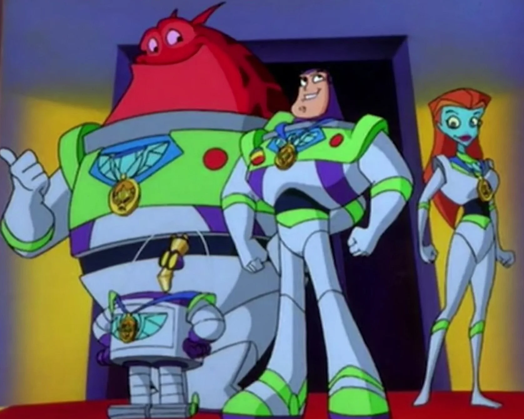
Here is an image from an old show called Buzz Lightyear of Star Command—and no I am not kidding because as silly as this is, each of these characters is completely different!
Two are aliens and one is a robot, but they all use either a standard uniform that has recognizable shapes and colors or the symbol of Star Command— the faction that they belong to.
(All right, all right, let’s get more nuanced since you rejected my last example on sight).
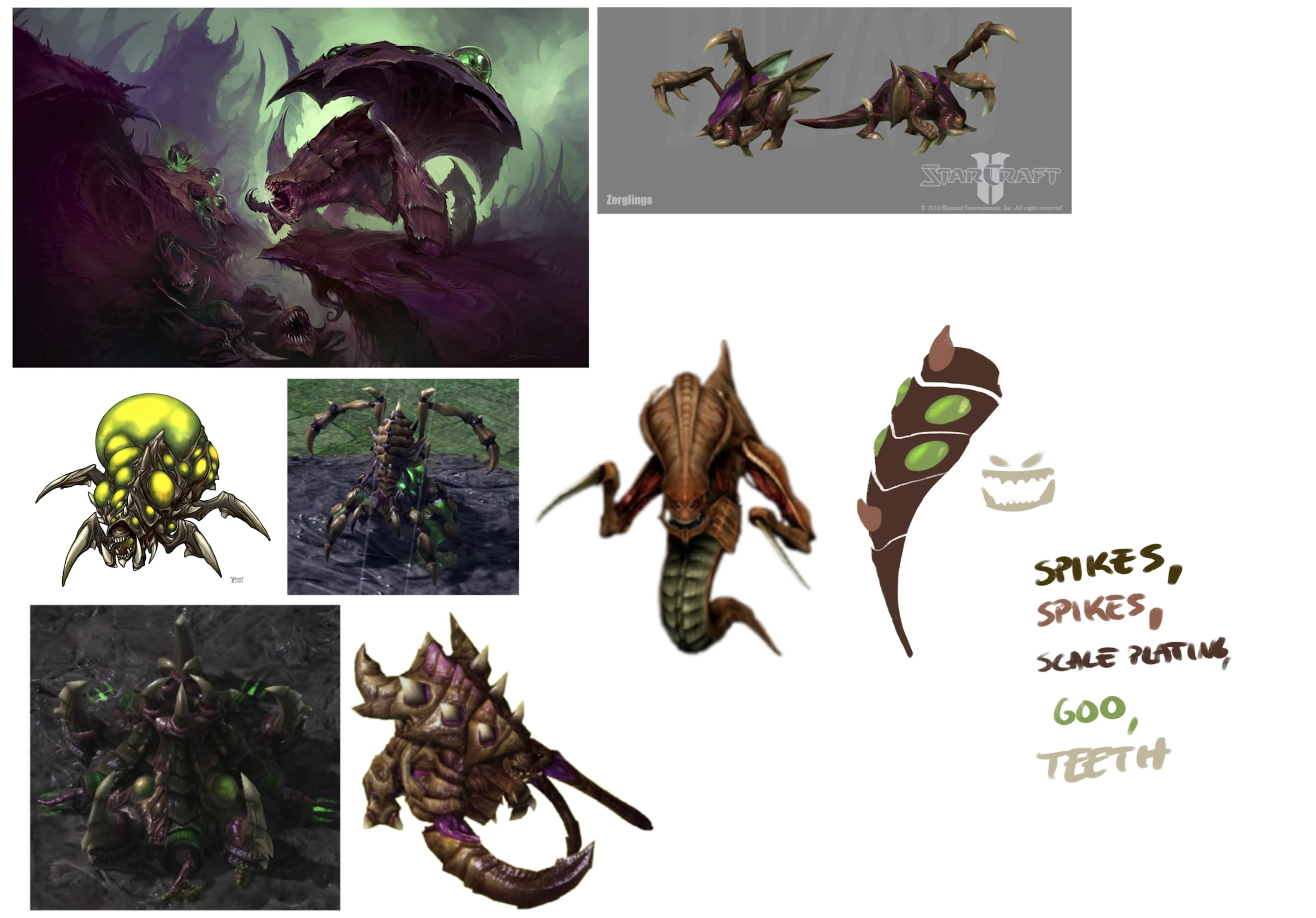
Starcraft is a game series that is largely defined by 3 separate factions:
The Terrans
Basically just Earth humans in space
The Zerg
The primal, hive-mind bug aliens
The Protoss
The enlightened noble aliens
Now from a functional standpoint, it helps for a player of the game to be able to differentiate units apart from each other but also be able to tell what faction they belong to.
So, the Terrans use lots of rectangular shapes. They have panels and rivets, their aesthetic combines construction equipment and space travel equipment and the NFL robot mascot. Every unit that you see is plausibly piloted by a human, whether it’s a little race car, a little mech suit, or a really big boy mech suit.
The Zerg are completely organic and grotesque, so their buildings are organic. They have insectoid features. I think the paneling is something of the epitome of Zerg design— a large, glowing sack and a bunch of insectoid legs. They’re overseen by queens and defend their hives with acid and venom. Gross.
The Protoss use advanced technology beyond our comprehension to warp their units and buildings in. There’s an element of organic design to their units since they do share a predecessor with the Zerg, but it errs on the side of elegant and mysterious rather than grotesque. You’ll notice lots of long, teardrop shapes, golden panels, and glowing blue lights, along with their elevated beings that radiate a sort of blue electricity.
Even the names of units help provide that feeling. the Terran’s base is called a Command Center, The Protoss’ is called a Nexus, and the Zerg’s is called a Lair, or Hive.
Really, the kinds of units available in these games are wide and varied, but applying the design language of one of these races immediately identifies them and appropriates them.
Develop a design language starting with a simple shape, kind of like a logo or pattern.
Applying this across existing designs might be enough to identify them with your group, or at least work as a starting point for more iteration.
Adding a predominant color or range of hues to these characters achieves the same goal.
We don’t need them to all be the same people, the characters can be individuals who disagree and think apart from each other. We just need to be able to show that they come from the same place.
All of us on earth here are different, yet if we use clothing that comes from a particular culture, OR, even a particular decade, it becomes easy to place that people.
I think this is a really interesting process because, again, you’re not just drawing with your hands, you’re using a little “marionette’s hand” to draw for you on certain levels. You’re getting into the mind of characters to then make things.
I think the biggest balance to strike as well is just how different the people in this group are from each other. Do they have a literal hive mind, sharing the same thoughts? Or are they more individualistic?
I also think there’s a lot of fun to be had designing multiple factions, because it gives you that chance to contrast and make opposites between them, and as soon as you have more than two, it becomes about creating a variety that’s more than just opposites.
Interested in making a cohesive design for your cast of characters? Check out this video here on How to Make a Cohesive Cast!
Let’s Talk About A Design Prompt For you to Take on!
This is something I haven’t really done before, but I want to actually give you an exercise because I think it will really sell the idea that we’re talking about with color, shape, and feel. (This is doubled-down on because Burger King just released some cool new branding).
Anyhow, I want you to take two or more different logos from companies and create a faction. Create a Taco Bell tribal army! Or Starbucks spacefarers or even the Burger King’s Knights of the Cafeteria Table!
Challenge yourself: do something more elevated than just their usual uniforms. These are logos and brands that have had a lot of thought about perception and meaning put into them. So don’t just slap the literal logo onto a character. Use it to inform the overall design.
What is the McDonalds armor going to look like versus the Chipotle or Starbucks armor? How do those shapes and ideas and colors evoke something about the brand, that is now a bunch of pirates or aliens?
You don’t have to choose fast food, you can choose something local to where you live as well, but I want to see what you come up with!
Tag me @bageldenizen on Instagram if you do, because I’d love to see what you came up with.
Do you Want to Master your Digital Art and Character Design Skills?
You Can Do it in Just Six Steps
Hey! I’m Brookes Eggleston…
If you’re new here, welcome! I’ve worked in studio settings and in a freelance capacity as a Character Designer, Illustrator, Story Artist, and 3D Modeler for nearly 15 years. But what I love as much as drawing characters is sharing what I’ve learned. Get to know my mission here at Character Design Forge.
